
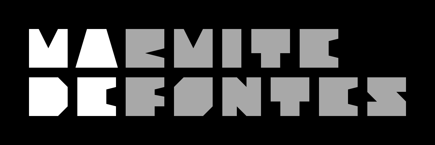
Why Marmite Defontes?
About the name of my type foundry, and a bit more…

You probably guessed it, it has to do with food. If you don’t know me personally: food plays a large role in my family’s story and legacy. One of my grandfathers was a butcher and the other one was a baker. Call that the sandwich family! My mum used to work as a chef and visiting gourmet restaurants is a “sport” for us.
Food and culinary culture is deeply rooted in my education and my habits. And so it echoes in my work. I frequently use food metaphors and comparisons in the design work to convey ideas and explain concepts.
Ten years ago I think (2011-ish), I decided to name my type design practice using the analogy of food. This name still feels relevant today.
Marmite: the container, where you can stew a bunch of recipes that you can share with friends and family (and customers).
Defontes: it could be the name of a distant ancestor or a former Duke of Fonteshire. Or maybe a limousine rental company, or a jazz club in Brooklyn, or a manufacturer of spoons and kettles… Who knows? No matter. As long as it contains what the project is all about, aka making and selling fonts.
Nerdy detail
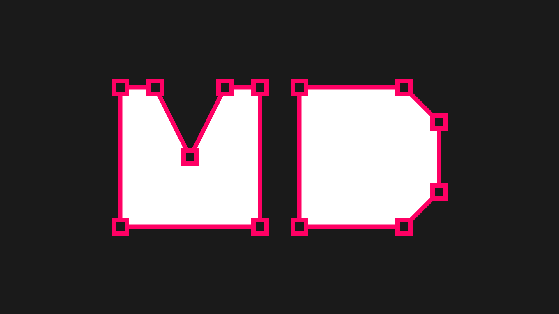
The Vendor ID for the foundry is MADE. A Vendor ID is a four-character unique ID that identifies font vendors. Microsoft is maintaining this list. I like the fact that it is not ‘just’ an acronym but that it reflects the craft of making fonts. #Homemade
Housekeeping
The platform that runs this newsletter - Substack - enables your participation. So please, do use these features. This way it doesn’t feel like I’m having a monologue in the middle of the (digital) crop field.
You can:
- Like this post
- Use the comment section to drop your comments, questions, feedback, hopes and dreams. I’ll do my best to be a good host.
I speak français (si vous êtes plus à l’aise avec notre belle langue)
These features are available at the top and bottom of the emails.
On The Back Burner
Some extra and miscellaneous content nuggets for you.
📚 Just ordered the book “Do Start” from the Do BooK collection. I hope it will provide a few tips for me to run a type foundry…
😎 Need some joy and optimism: have a look at Ashwin Chacko’s work. Bright and positively moody illustrations.
☕️ Sun #1 • Really like the new branding for the coffee company Top of the Mornin’. Produced by Earthling studio.
🖍️ Sun #2 • Speaking about the sun, have you encountered Tad Carpenter and his Sunday Suns project? Sure it’s inspiring and rich.
🌤️ Sun #3 • We can all use some more sun. Spring is on the corner after all. Please have a fourth sun: Seu Jorge covering “Everybody Loves The Sunshine” (2010)
—› Apple Music — Spotify — YouTube
That’s it for today. Until next time, cheers!
Guillaume
PS: next edition is about 3 coming font families. 🤫
You think someone would like it?
If you know someone that might like my work and the content of this newsletter, you can use the button below to share some love for me. Thank you!