Updated Fonts, Incoming Typeface, Music and More
Snacks are back, Twig progress and a trip to Iceland.

Good day people!
First, I’d like to welcome the new subscribers. I’m happy you are here with us. I got a 10% increase in the number of free subscribers lately, which a great motivation for me.
As for the content of this post: summer is still here, I’m sharing updates and progress on two font families, a concert and some miscellaneous links at the end. Enjoy!
🎟️ For paid subscribers: there’s a glimpse at the next font family and next steps for the foundry.
Snacks update for the win!

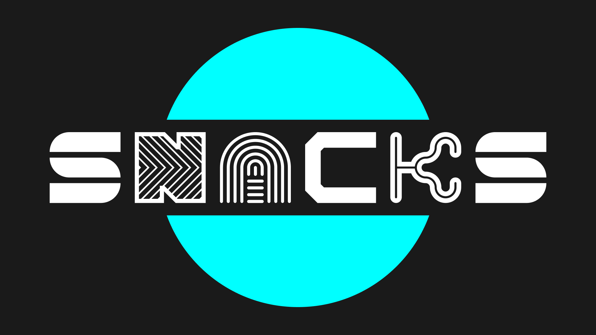
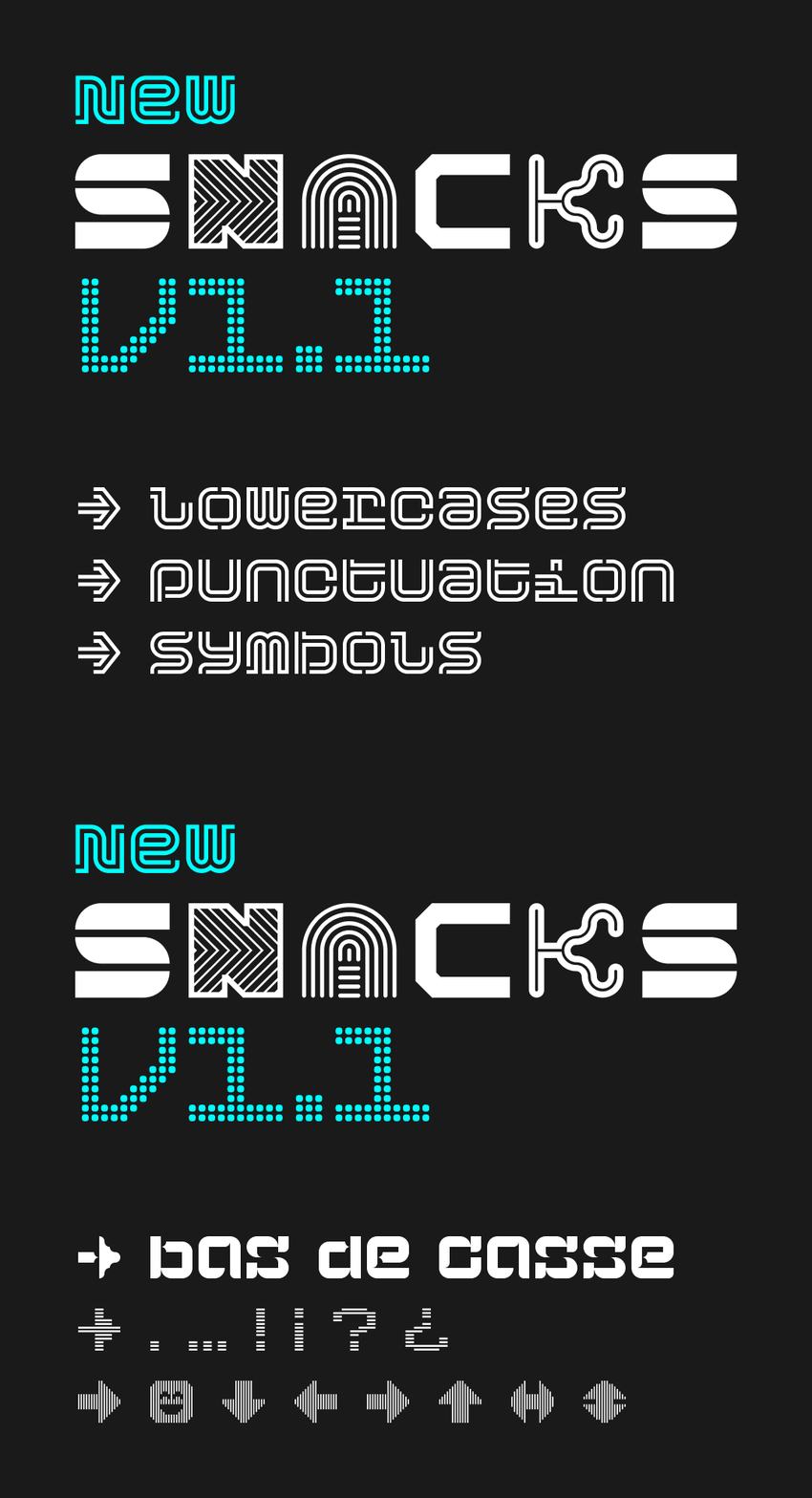
Last week, I published a version 1.1 of the Snacks collection. Discreetly published on a Sunday evening… **Now I’m telling you!** It features brand new lowercase designs and a bunch of punctuation marks, as well as a series of symbols. There was 720 glyphs in the previous version. Now we are talking about 1540 glyphs. Booya: +214%. You’re welcome.
Needless to say, it was a lot of work and a lot of fun too. Here is a couple of facts and learning:
- Leaning back into a former project takes time (more than anticipated)
- I obviously wanted to revise existing characters, and was quite reasonable with that (paddling myself in the back)
- I did “rebuild” some styles from the ground up, benefiting from new techniques learned with Glyphs
- The punctuation marks are not all monospaced, didn’t make sense to force it
- Left room for a V1.2 or a V1.3, but probably not a V2.0
- Updated the specimen
ℹ️ Updates are free for existing customer. Please use the “Customer login” link at the bottom of each page to access your previous order(s) and download the latest files.
Twig is growing
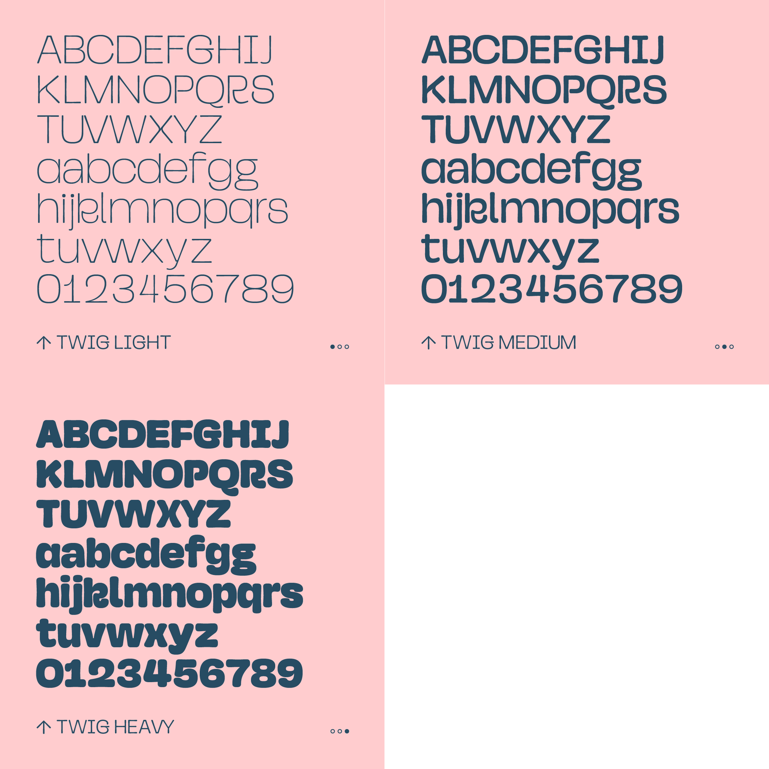
I’m making good progress on this family. The upper and lowercase are more or less stable right now. Of course there are tweaks to be made to achieve more consistency and overall balance. But I’m happy with how it turns out.
I started to work on diacritics and punctuation marks. You know, diacritics: all those marks topping or underlining some characters, mostly for all languages beyond English =D. Well… I struggled a bit. Twig a for sure a display font, but it leans in the realm of Sans Serif fonts. So naturally I went for marks in the Sans flavour. Didn’t work. It felt weird and off. So I did some research and tapped into Serif’s vocabulary. It feels more aligned with the initial design intentions. And it’s funny that a font inspired by plants end up mixing influences from two genres of typefaces. Definitely a hybrid result. 🌱🌱🌱
The next step is to settle on the weight distribution. Discussing the project with (designer) friends, I realised having 6 different weights was not a good option. First it means more work, so the release window moves away. Secondly: the value proposal. Six styles don’t mean six times the value of the product. If those ‘artificial’ styles are here for the sale’s package and are not used in the end… Well, what’s the point? Right now I’m heading to 3 styles. Probably Thin/Light, Medium and ExtraBold/Heavy. People will still be able to play with the variable font files if they want intermediate weights.
I hope to release a first version of Twig by the end of September, beginning of October. Stay tuned!
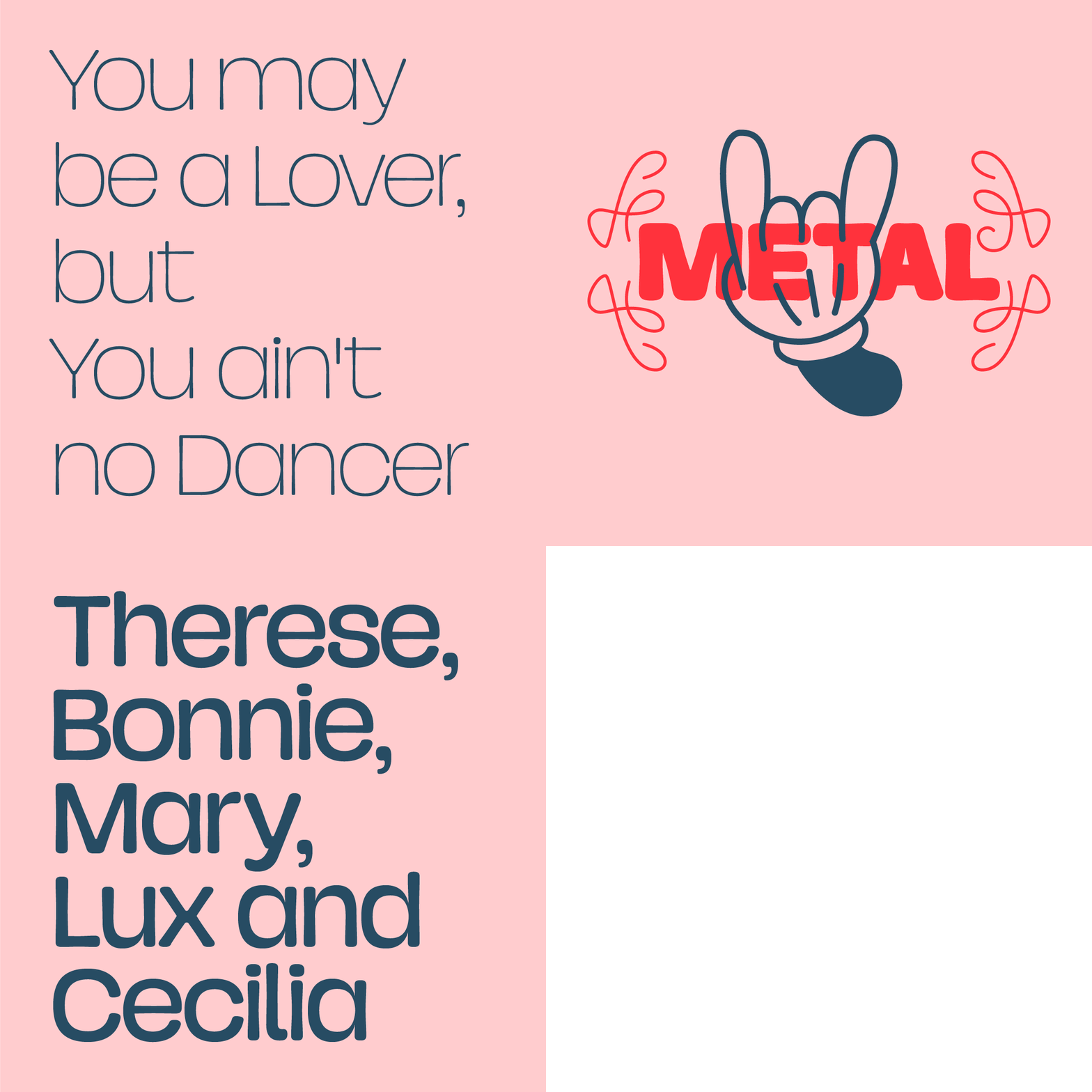
Here are some sample images of the current work in progress:


Iceland trip? An excuse to chat about creativity
(Enjoy the view and the music)

I’m really getting hyped by adding music elements to this publication. This time we travel to Iceland. The trip is proposed by Cercle. You first can enjoy the 1-hour concert in the middle of nowhere/somewhere. Ólafur Arnalds and his bandmates deliver an ethereal soft then shaky performance in a beautiful location when the day has no night.
The interview that follows scratched my interest. Especially when the topic of creativity was discussed. In a country with a population of around 380.000 people, it seems the artistic talent ratio goes through the roof. Ólafur gives an interesting point of view, where the lack of the music business pressure, the environment (geographic and social), the government support or the history and culture ; all participate in creating a unique context, favourable to music that stands out.
He also sees technology as a tool to create outside of our usual way of thinking. I connect this discussion with a documentary on Björk from 1997. She explains that people think there is no soul in electronic music and that people are blaming computers. I love these two sentences: “If there’s not soul in the music, it’s because nobody put it there. And it’s not the tools’ fault.”
Twist this for a while in your brain and for the work you do. Tools and technologies are extensions that should not paint over our intentions.
🎟️ Paid subscribers section — consider subscribing ;)
Quick links
Lego Braille Bricks 🧱
Have a look at this 4-minute video introduction to the product. It has to do with education and language and communication, and, of course, letters. I’m really glad this idea became a reality. This 2011 concept is now publicly available in English and French, but more languages (11 it seems) are listed.
Space10 Is Closing 😢
There was a special place in Copenhagen. A place for experimentation, research and design practice. This place is named Space10. They announced the place is closing after almost 10 years of activities. They have been working on prospective ideas for the future of living. This lab was launched by IKEA in 2015. The project highlights and team profile remain available on their website. Long live Space10!
“Where do fonts come from? This one business, mostly” 👓
An article by Sara Friedman for The Hustle. A very good overview of the font business landscape. At the centre: the Monotype monolith. Topped with examples of designers managing there way through despite the situation. This cocktail still tastes bitter to me.
Celebrating 8 years of Typemates 🎱
Some fun and engaging ways to celebrate an anniversary by sharing fun facts and hard truths about running a foundry. I’ve been warned. And yes, people are still tweeting.
That’s it for now. See you in the next post, cheers!
Guillaume
