
Summer 23 edition
A bit of sun, a bit of fun and a bit of fonts

Back from a short summer break, here is some news about Marmite Defontes and content nuggets for your entertainment! 😎 ☀️
Ladies and Gentlemen, I present you the Menu:
- Snacks is getting an update, a big one
- The First weeks of the website
- Sneak peek: Twig is gonna twist your world
- Do Quote
- Quick links
Let’s go!
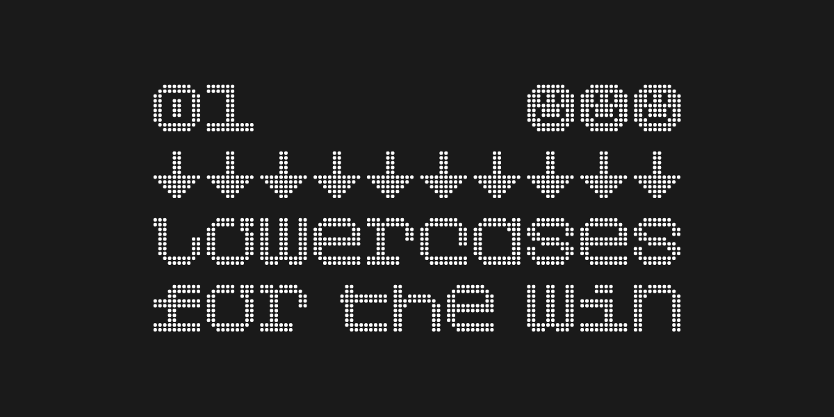
1. Snacks is getting an update, a big one
The Snacks collection is in the rework. I took some time during the summer to start updating the 20 styles. I’m adding lowercase designs to the font as well as some punctuation marks and a couple of symbols. That represents +150% character addition to the project. More fun and opportunities to design cool stuff with it!
Snacks collection starts at €19 for 20 styles and the coming update is free for all people who purchased a license (if you ask me, it’s a great deal). I hope to publish this update later in August.
Here’s a sneak preview at what’s coming:
🛎️
Kind reminder: there are still a couple of unused coupon codes from the launch of the website to get 20% off. These coupons expire by the end of the month. Just saying…
COUPON CODE (20% OFF): Summer23Launch
2. The First Weeks of the Website
It’s been 3 weeks since the launch of the website. I’m glad it’s out, because now I can get more time on the actual products: the fonts! And, of course, promote the foundry. The foundry was added by Mark and Thomas to their type foundry index Type.lol.
I’ve packed a couple of data, insights and ideas so far.
[ This section is available for paid subscribers only ]
😱 I wrote a 4,200-characters long text! 😄 Either boring or very interesting… 😏
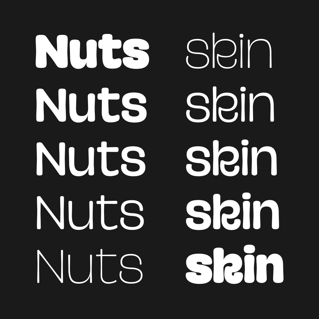
3. Sneak peek: Twig is gonna twist your world
- Codename: Twig
- Variable font family
- 6 styles (so far): Thin, Light, Regular, SemiBold, Bold & ExtraBold
I started sketching this typeface when finishing Piggle. The idea was to provide Piggle with a “sister” weight, something thin yet solid. Like a bamboo, that bend but do not break. The early tests showed there was potential for a dedicated font family.
Clearly, the inspiration comes from the plant world, hence the name 🌱. You can think of the lines and joints of the design elements as plant stems and branches that grew to shape letters. I’ve collected a bunch of pictures from different trees as a reference library: hazelnut trees, chestnut trees, willow trees, etc. This inspiration is especially visible in the Thin weight (the starting point). I’ll see how well I can carry this on to the Extra Bold version. The “leafy and planty” characteristics will probably shine in the special characters and ligatures. Did someone say “flourishes and swashes”?
💬 Please use the comment section to tell me what you think so far.
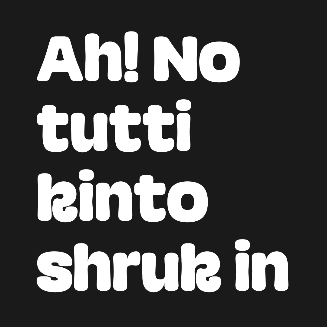

4. Do Quote
There are a couple of books on my reading list for the summer. The second book I just finished is titled “Do Design, Why beauty is key to everything” by Alan Moore. I really enjoyed it. It is filled with clear ideas about why humans should express themselves creatively. It is not about aesthetics and it’s a great source of inspiration in our daily lives.
I’ll probably read it once a year as a reminder and a refuel for why we do what we do.
I selected the quote below - amongst all the good references - because it’s a well-crafted summary of my state of mind right now.
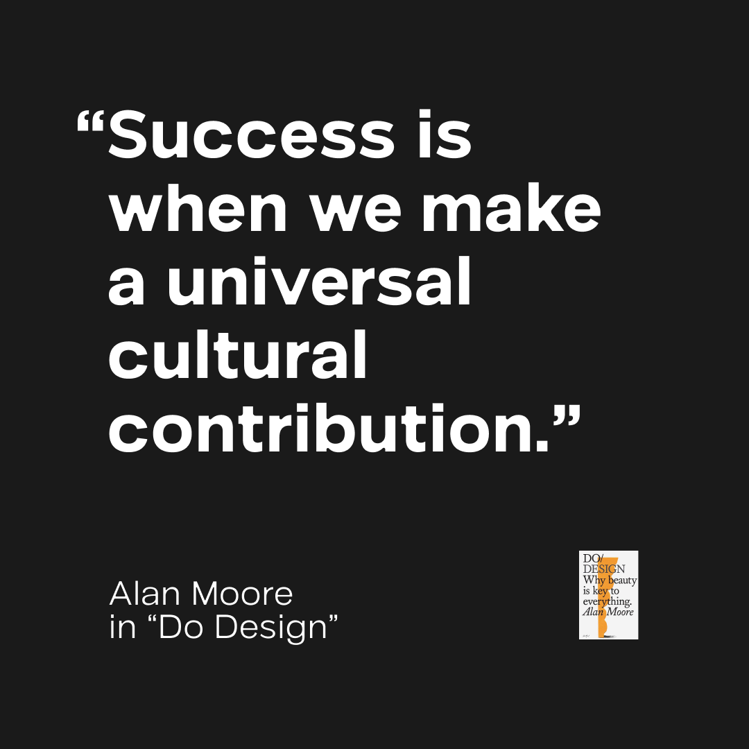
In case you were wondering: the typeface used in this image is on work in progress family called Noxi, soon available in beta to paid subscribers.
➡ Check out the Do Books: it’s an excellent collection and a great publishing house! The Do Lectures are bangers too.
5. Quick links
- Super interesting (and complex) type project for Tokyo Dome City by Studio &Form and Toshi Omagari (type design & font development).
- Fun and short article by Elissaveta Brandon at Fast Company on the naming process for fonts.
- Smooth music for your ears: a live version of the track “In Your Eyes” by BADBADNOTGOOD feat. Charlotte Day Wilson
That’s it for now. Until next time!
Cheers,
Guillaume