
Pictograms, Condensed Sans and Masks

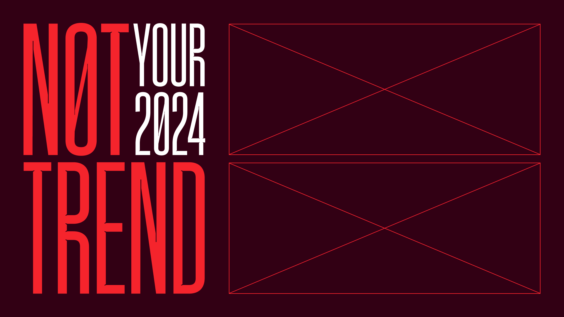
Marmite Defontes - Newsletter #11 - April 2024
Good day folks!
This newsletter is a transition from winter news to the next font release.
Here’s the menu
- Noxi Just Got Pictograms
- A Condensed Sans in Progress
- Miscellaneous Links
- Music Break with Masked Performers
Reading time: ±5 minutes
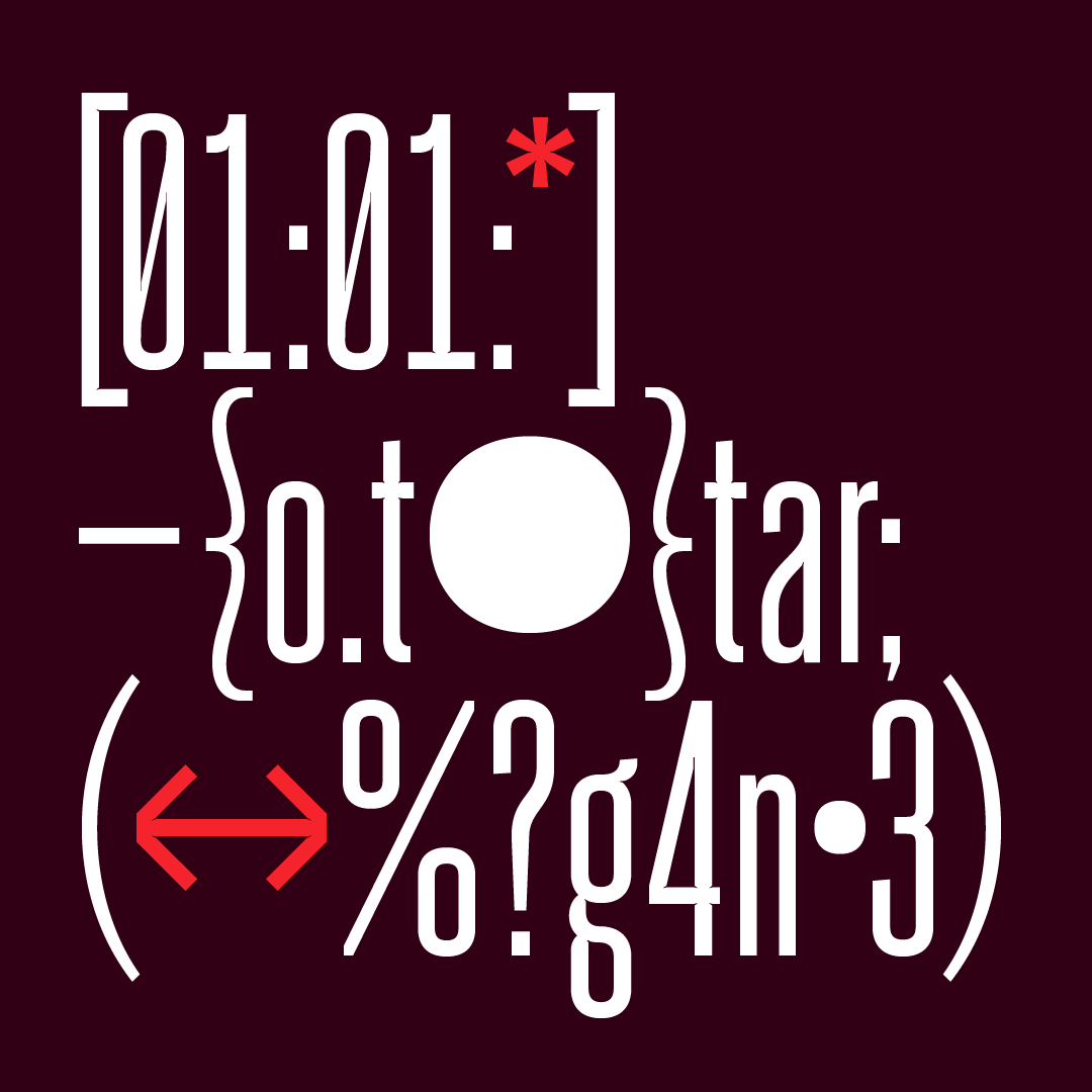
Noxi Just Got Pictograms
The next foundry release is Twig (very soon). But I’m already planning what’s next. Noxi font family (that you can preview on this page) is gonna be my main focus in the coming months. The goal is to release a first version this summer.
As this project is quite serious (aesthetically speaking), I needed to have “something” easy and fun in it. A design activity I can do when bored or saturated with the labour of the main family. It’s gonna be a series of pictograms. This way Noxi will have a companion font with symbols and emojis, that share the same attributes. Perfect for branding projects or signage.
The pictogram font’s name is Noxicons. It will be part of the full-family set and will also be available as a separate affordable pack. Just like Noxi, Noxicons will span across 6 weights and be variable. Just like Material icons.
Here’s a quick preview of the early tests.

A Condensed Sans in Progress
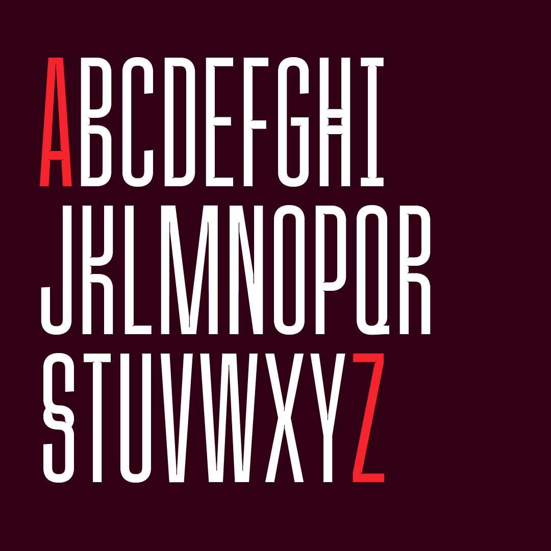
I probably have more than 10 years of type design work with the current font family projects laying either in notebooks or on hard drives, but… I started a new one. Condensed fonts always had a strange effect on me. I very rarely use them in projects, but each time I see one, I tell myself: that would be a good font choice for this or that. Most of the time, those are ideas for editorial work of posters. So why not create one. Challenged accepted! Meet Taku, a condensed mutant sans serif.
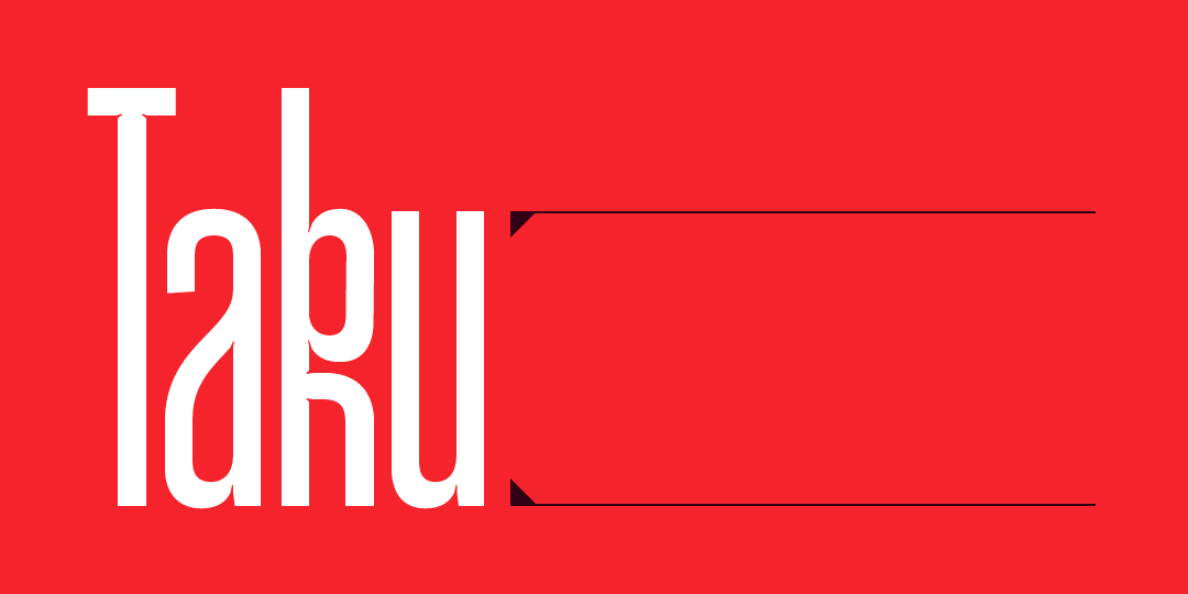
Let’s unpack what Taku is about currently:
- It sits between an ultra condensed and a condensed font.
- It has a rigid almost mechanical design with a twist
- Mutations and inktraps are the twist.
- It is clearly made for large displays
- I’m still trying to figure out if it should be a multi multi-weight or if one style is enough for a first version
- There’s 232 glyphs already, including uppercase, lowercase, two sets of numbers (regular and tabular), punctuation marks, a decent bunch of diacritics and a stylistic set to “remove the mutations”
- Meaning if you are interested in beta test it or think of a project suitable for it, just reach out!
Here are a couple of preview images
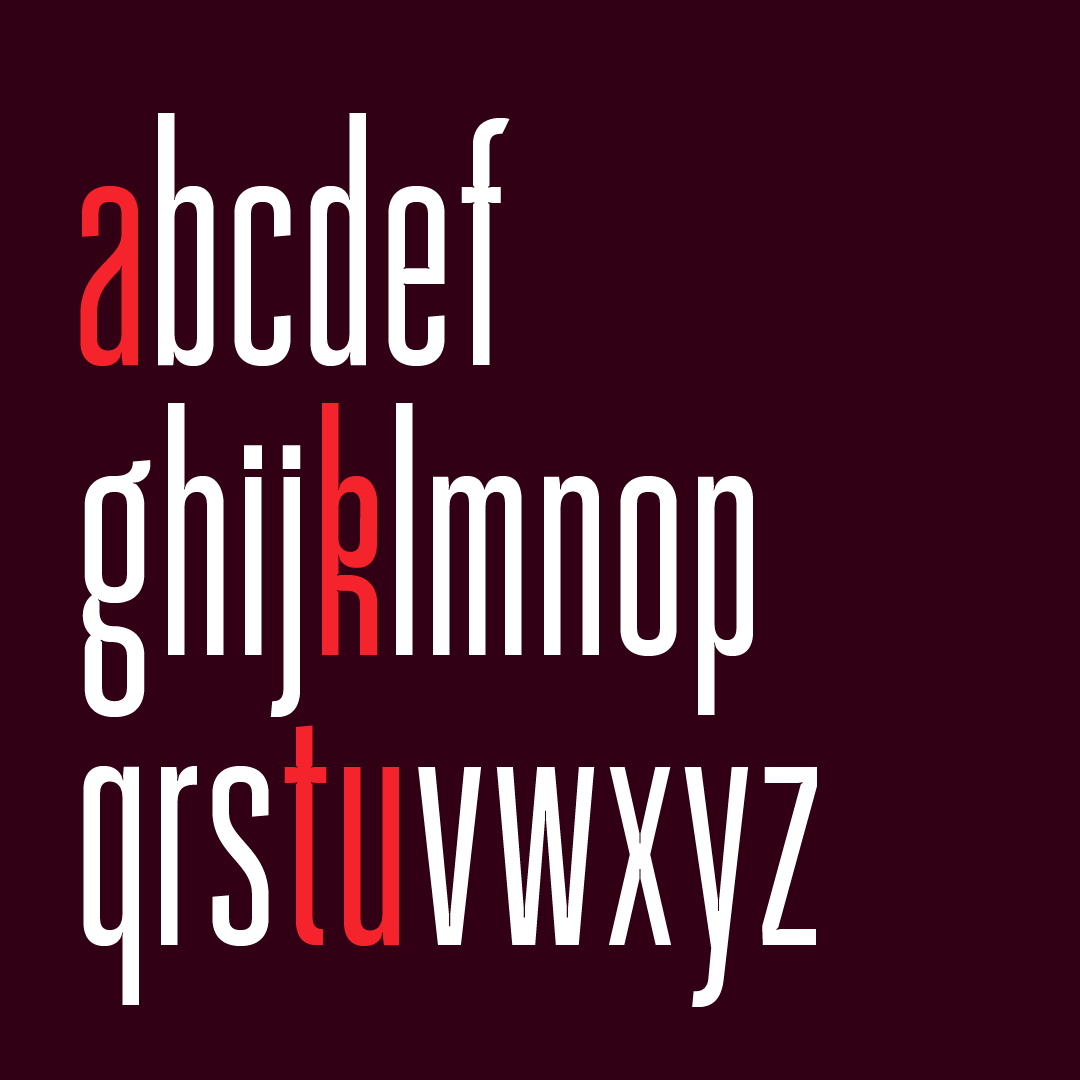
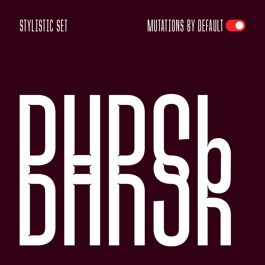
I shared some bits of this family with paid subscribers in late 2023. The working name was RB37, then I moved to names like Amal and Lyth (yes, there is 4 characters pattern here). But nothing clicked. Taku feels right today. The sound of Taku echoes the horizontal rhythm that the design provides. And the k lowercase enables me to showcase a mutation. Good enough for me.
Miscellaneous Links
1️⃣ Napoleon Dynamite Opening Titles
“Don’t play with your food,” or just do it for the sake of having a creative open sequence for a goofy movie. This is the case for Napoleon Dynamite. Via a tweet from Vedad Siljak. There’s an interview of Jared Hess (the movie director) on Art of the Title.
2️⃣ Universal Principles of Typography
A new book from Elliot Jay Stocks: “100 key concepts, theories, and guidelines for choosing, pairing, and using type”. Foreword by Ellen Lupton and available mid April 2024.
3️⃣ Aptos: Microsoft New Office Font
A post about the design process of the font family that powers the UI of the Office suite. Si Daniels explains why and how Microsoft teams approached this gigantic project. The sans and serif family was designed and developed by Steve Matteson. Elle Cordova made a sketch about the change 😄
Music Break with Masked Performers
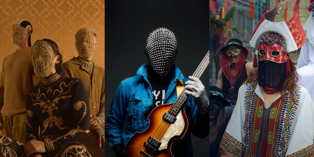
I have a theme for this edition music recommendation: people using masks on stage! Could have been a theme I was sharing about MF Doom back in the December’s newsletter. 😆
No, it’s not Daft Punk, but could have been Phantom of the Paradise as I have a font project inspired by this movie… But this selection is more modern and less mainstream.
First of, Glass Beams. I’m was immediately hooked by their track “Taurus”. Then I was sonically mesmerised by the track “Mirage”. Needless to say, that when they release their EP a couple of days ago: it was playing on repeat in my headphones. Even if the trio is from Melbourne, Australia, you can spot influences from elsewhere: India or Middle East vibes. Please enjoy a 5 tracks live session, published with the release of their new EP.
Next up is Eben Tenner‘s project The Destruction Of The Cult Of The Sun. As he’s defining it: it’s psychedelic funk pop music. I love this description: “Merges psychedelic electro indie funk to combat digital dystopia. His music, a vibrant blend with hidden truths, encourages awakening from our digital daze. Adopting anonymity, Eben focuses on the message, urging listeners to reflect on our digital existence.” Great story building. I’ve picked “Vibes in the Void”, a 15 minutes live studio session.
Last, but not least: Goat, a Swedish experimental psychedelic rock band. They perform since 2012 and their look on stage reinforces the rich and colourful aspects of their music. Please vibe with this full set at the Levitation Sessions.
Those 3 acts share at least one common thing besides the masks. Their visual universe is impeccable and on point. It feels like an intentional strategy to match the sonic and visual output. They are in control of their craft and how they communicate around it.
Talk to you soon,
Guillaume