
New Serif Sneak Peek, Engraved Fonts and the Usual Suspects

Subtitle: Marmite Defontes newsletter #16
Good day people,
This post was due in March, but you know… Life, work and other stuff got in the way. Anyway, here are a bunch of type and design snacks for your delight. Enjoy!
Here’s the menu
- First Glimpse at Mazzy Typeface
- Still Dumb: the AI Type Ramble You Were Not Expecting
- Design Nuggets
- Music Break
Reading time: ±6 minutes
First Glimpse at Mazzy Type Family
I was working on a brand identity lately and two logo concepts involved custom letter work. Those two concepts did not make it to the finish line, so I thought they might be good candidates for further type design explorations. I had already a couple of uppercase and around ten lowercase letters. Here comes Mazzy: a serif typeface, in the making.
I’m currently working on a Medium / SemiBold weight for the upright version and a Regular weight for the Italic. As you will see, this is quite a serious endeavour: serif + true italic. Very much out of my comfort zone. But that’s OK. I have got plenty of literature to explore, online resources available and people that I can reach out to for feedback and support.
I also started some historical research. My early sketches are a mix of different time periods with unusual details. So I’m digging into stone carving techniques, slab serifs, translation and expansion contrasts, the work of Berthold Wolpe with its two families Albertus and Pegasus.
I’ll probably give you a preview of the other family I work on (in parallel) and that is the second logo concept that was discarded. No serif and no italic for this one, though.
Still Dumb: the AI and Type Ramble You Were Not Expecting
I was super ready not to talk about AI in the context of type design in this newsletter, but… I guess one can change his mind when the timing seems appropriate. I assume by now, most of you have been in close contact (if not bombarded) with content on the topic. And typography was relatively safe as models were really bad at generating proper characters. Remember the time when generated hands had 6 or 7 fingers. We were there until a couple of weeks ago for letter generation. Getting OK results for a single letter was already working. Now we are talking about abilities to generate alphabets where consistency and accuracy have improved a lot.
This ramble was triggered by a recent post from a “visionary that uses AI to create without limits”. I discovered this post via the Brand New website. The guy claims he was able to generate a brand new font inspired by the Severance TV show logo. The climax of his short video is the statement that people don’t have to pay for licences anymore. Now let’s go below the surface of things.
First, let’s agree on the fact that this is clickbait content and that Sirio is most probably trying to get the best out of an opportunity. Still. There are a couple of interesting elements and questions.
Here are a couple of my notes:
- The video only showcases the use of AI for expanding the logo into an alphabet. You still have to put work into vectorising, splitting the letters, using a third-party tool to turn the separated vector shapes into a usable font file. Maybe it is helping you kickstart the idea but you still have to do the heavy lifting there. Nothing magical as advertised in the title.
- Generating a copy of a grotesque sans serif font (Helvetica clones) is not impressive, I guess. This is, for sure, the style that is the most used and documented. What about other styles? Well, I tried some of my funkier and display work: nope. It does not work well. And what about glyphs outside the Latin alphabet? Easy to train a model for “only” 26 letters. When we are talking about thousands of characters and hundreds of years of history, that is a totally different adventure.
- How did OpenAI train its model, by the way, to achieve that kind of result? I bet it was on copyright materials. Publicly available materials yes, but still protected in many countries. Regulation is still lagging behind on this topic, but don’t you worry that “companies” (understand organisations with a capitalist way of growing) are gonna take any mean necessary to avoid legal actions and bad press. OpenAI has already planted seeds in its tool to prevent infringements of “some” material. Preparing my popcorn for when Monotype realise the potential for getting money out of this: whether it’s getting after OpenAI or signing a partnership with them.
- This is the beginning of an idea. And that is very interesting. Being able to explore different options and details in a matter of minutes is pretty darn interesting. As long as you have a design brief, or that you set yourself directions, having those tools at hand (and being able to afford them) can save you some time. What AI tools don’t have is intent, and the reasoning required to push the idea through.
- Licence is not the argument: time and craftmanship are. Maybe what we see in the video is true. But how much time should you spend before reaching a workable and satisfying version of your idea? The beauty of the licencing is that you can rely on the craftmanship and time that others have put into the work and benefit from it for a very tiny fraction of the effort it requires to. Would you rather spend 5, 10 or 20 hours on copying an existing font in 1 weight (and most probably be disappointed by the limits) or would you spend 30, maybe 50 bucks to access a professional typeface and spend those hours for what really matters to you?
- We are onto something, but long is the road. Good job Sirio, you succeeded in making (some) type designers pay a closer look at AI capabilities.
Side note A
We leverage computer “intelligence” already in font production. For instance, I’m working with the Kern On plugin to help me with kerning. This tool uses machine learning to partially automatise a very tedious and time-consuming part of the job.
Side note B
I also did some tests for lettering work. ChatGPT produces very decent outputs for Latin-based tests. There are good warnings to prevent exploiting existing artworks, but generic prompts can get you already far enough.
As I was preparing this text, Groteskly type foundry published a post on this topic as well. Go and check it out!
Quote from the article
Being a professional type designer takes humanity, perception, taste, and love for your craft—all the qualities AI desperately lacks.
Design Nuggets
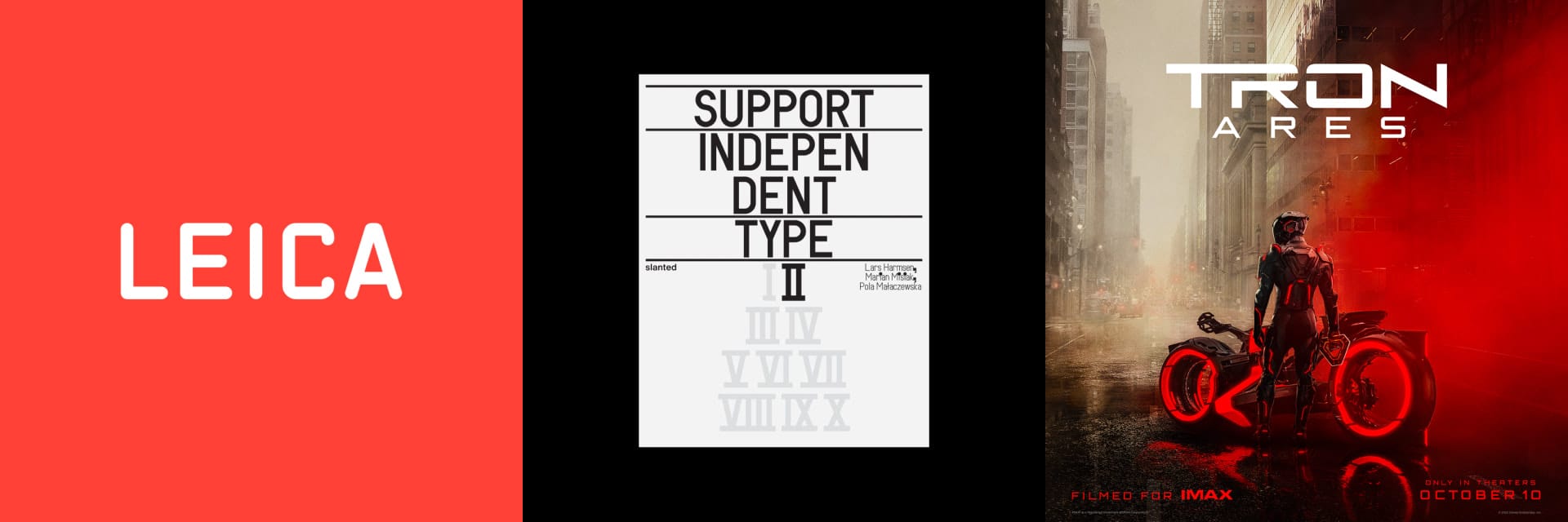
1️⃣ Engraved fonts: Leica’s, Machines and Industrial Goods
Two very interesting reads in one nugget. It’s about engraved fonts. Fonts on electronic devices, on industrial materials, on signs, etc. There is also information about the machines that are or were used to trace and engrave those characters. Fascinating!
Links:
2️⃣ Book: Support Independent Type ll
A book about type, how predictable of me! I bought the first edition twice: once for my own library and the other one to gift at a conference I gave on type design. I’ll definitely put this second edition in my library. I love the commitment that Slanted publishing has towards indie type foundries. Maybe you’ll find Marmite Defontes in the third edition… Who knows!
3️⃣ Movie: Tron Ares Official Trailer
Boom! Here comes the trailer for the upcoming and next Tron movie. This instalment of the franchise. The lore of Tron is still relevant to this day. Our relationship to “machines” and the digital space. Programs as personalities with agency and motivations. I’m also very excited to ear the soundtrack produced by Nine Inch Nails. October 10, 2025.
Music Break
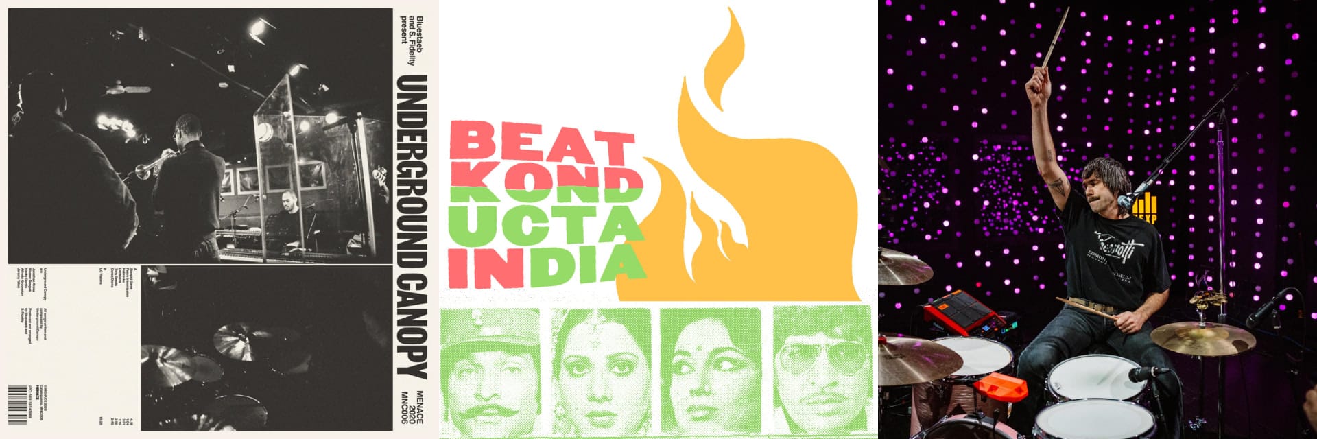
🎸🪴 Underground Canopy “Tony Sendo”
Paris-based jazz formation, soulful and cinematic grooves, flirting with genres like electro or hip hop. Ideal for deep work sessions or reading a book on the balcony. I picked the track “Tony Sendo”, because it packs different atmospheres and tempos in just three minutes and fifty seconds.
📦💃 Madlib “Movie Finale”
Keeping the cinematic approach for this second suggestion. A Bollywood-inspired beat (that you can find on Mos Def’s “Auditorium” track). Deep bass and downtempo rhythm. Imagine you are a spy in India in the mid 70s…
🎸 🥁 Death From Above 1979 - Full Performance (Live on KEXP)
Rock’n roll to close this music break. If you don’t know Death From Above 1979, that is a wonderful introduction to their raw energy and high-power tunes. A sound wall with one drum kit, one bass and a microphone.
Talk to you in the next one ✌️
Guillaume