
Book, Spring Cleaning, Process and design nuggets

Marmite Defontes newsletter #12
Good day people,
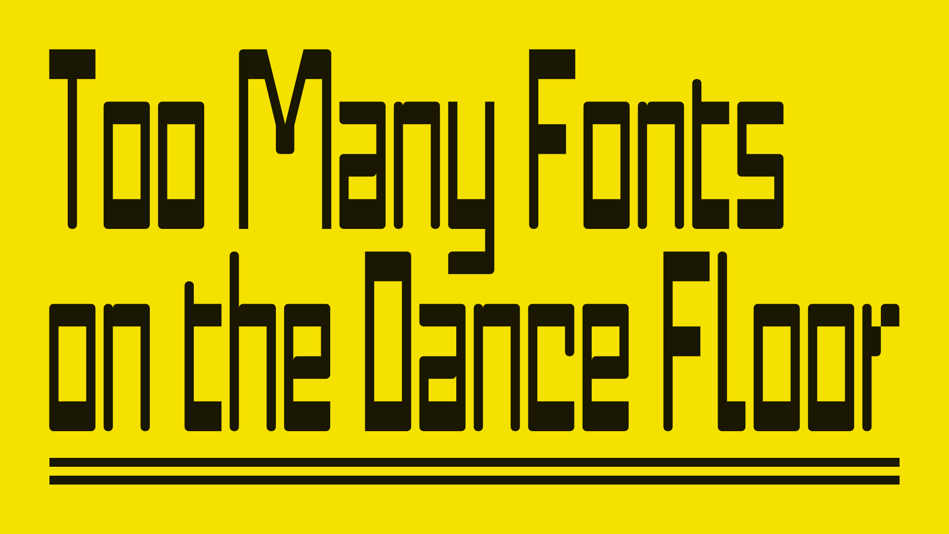
Hope you are doing great! On my side, I’m still working on Twig font family, but very slowly (slower than expected). Nevertheless, I’m also tinkering with “stuff” related to type design. Among those things, there are my type design process documentation, a Figma template for showcasing font choices and Opentype features, type design research for (again) new families and data gathering for 2 long reads on the type industry. So I’m OK not being able to publish Twig just right now.
Here’s the menu
- Marmite Defontes in a Book
- Spring Cleaning & Process
- Picture Drop
- Interesting Design Nuggets
- A Music Break bridging 1978 to 2024
Reading time: ±4 minutes
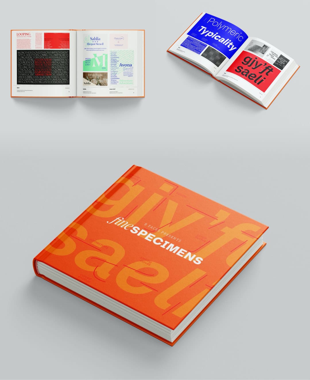
Marmite Defontes in a Book
That’s right. I’m really happy to be part of Elliot Jay Stocks new book. The book is called “Fine Specimens” and the Kickstarter campaign started a couple of days ago. The project just crossed the 33% line as I’m writing these lines.
The list of participating foundries is amazing: 58 and counting. Beyond happiness, I feel humble and excited for this project. I’m not asking for your money, but if you can help spread the word, that would mean the world to me. The campaign runs until June 13th and the book should hit the shelves by November. 🤞
Spring Cleaning & Process
I told you in the intro that I’m working on documenting my process. For a couple of reasons. The first one being that I need to better frame the steps required for me to bring a font family to the market. Otherwise, I’ll navigate blindly and will simply go back to procrastination and low-focus production times. I also hope that documenting it will help others and that I can get feedback and improve it over time.
Previously, I’ve been doing the folder cleaning and sorted everything with a common structure (content for another post I guess).
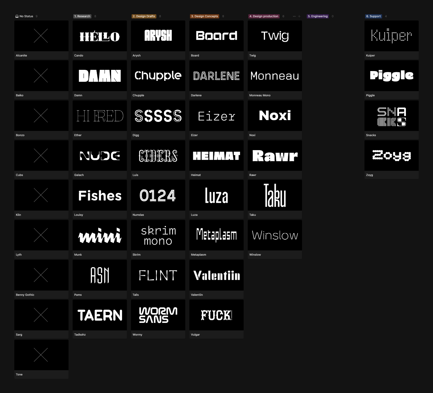
The documentation step I’m talking about today could be called “Project Management 101 for Font Production”. List the font families in the pipeline and triage them Kanban style. It is inspired by lectures, training and conferences I watched. It allows me to have smaller and more manageable tasks to do rather than “Task one: make the complete font”.
It consists of 7 columns representing the 7 stages of a family production:
- No Status: the embryo of an idea, nothing really defined: the spark.
- Research: I started doodling around letters and made a couple of research to define the scope of work and technical needs.
- Design Drafts: getting more serious with the drawing parts to able to use an early version and make decisions to move the family forward. Still room for experimenting at this stage.
- Design Concepts: advanced prototyping for the family where I validate all the design decisions, styles, features and character set.
- Design Production: aka full production mode. Spit out vectors and fill all the missing glyphs. And also proofing the font regularly
- Engineering: more proofing, testing the files, finalises spacing and do the kerning. Advancing specimen graphics at the same time.
- Support: the family is on the market, it can be updated and improved.
My personal report: 43 families in the pipeline (gosh). The good news is that the number drops as we move to the right of the board. Hopefully, I’ll have one family in the engineering column at a time and the support column will grow smoothly.
Here’s a screen capture of my Notion board:
Troy Leinster shared the other day a great summary about his font production process and why he needs that in his practice. Have a look! He gave a talk on this at the ATypI conference in Brisbane. Can’t wait to watch it once it’s available and I will share it with you.
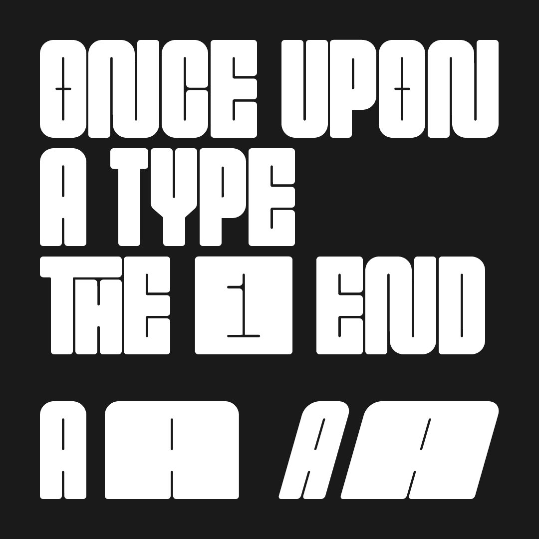
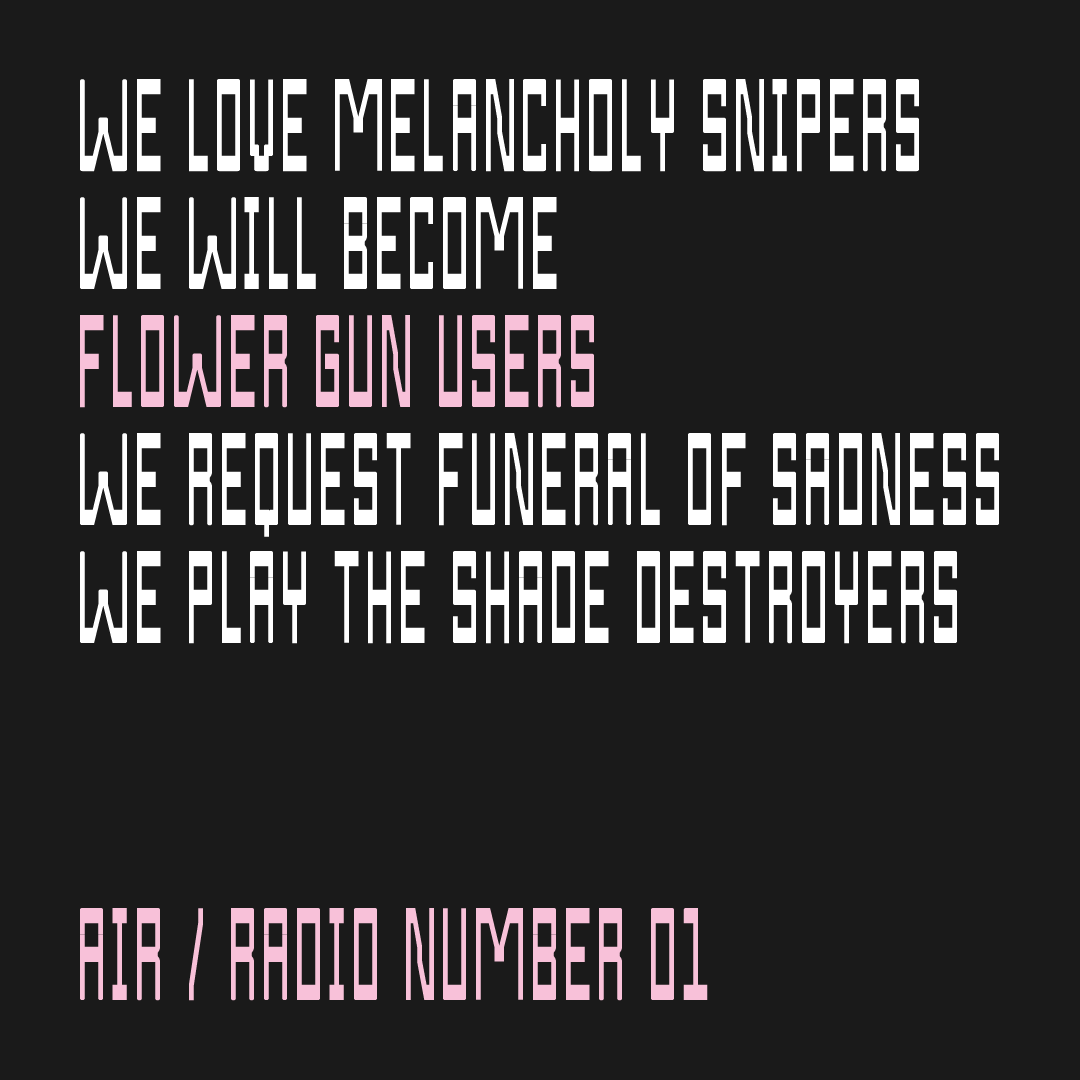
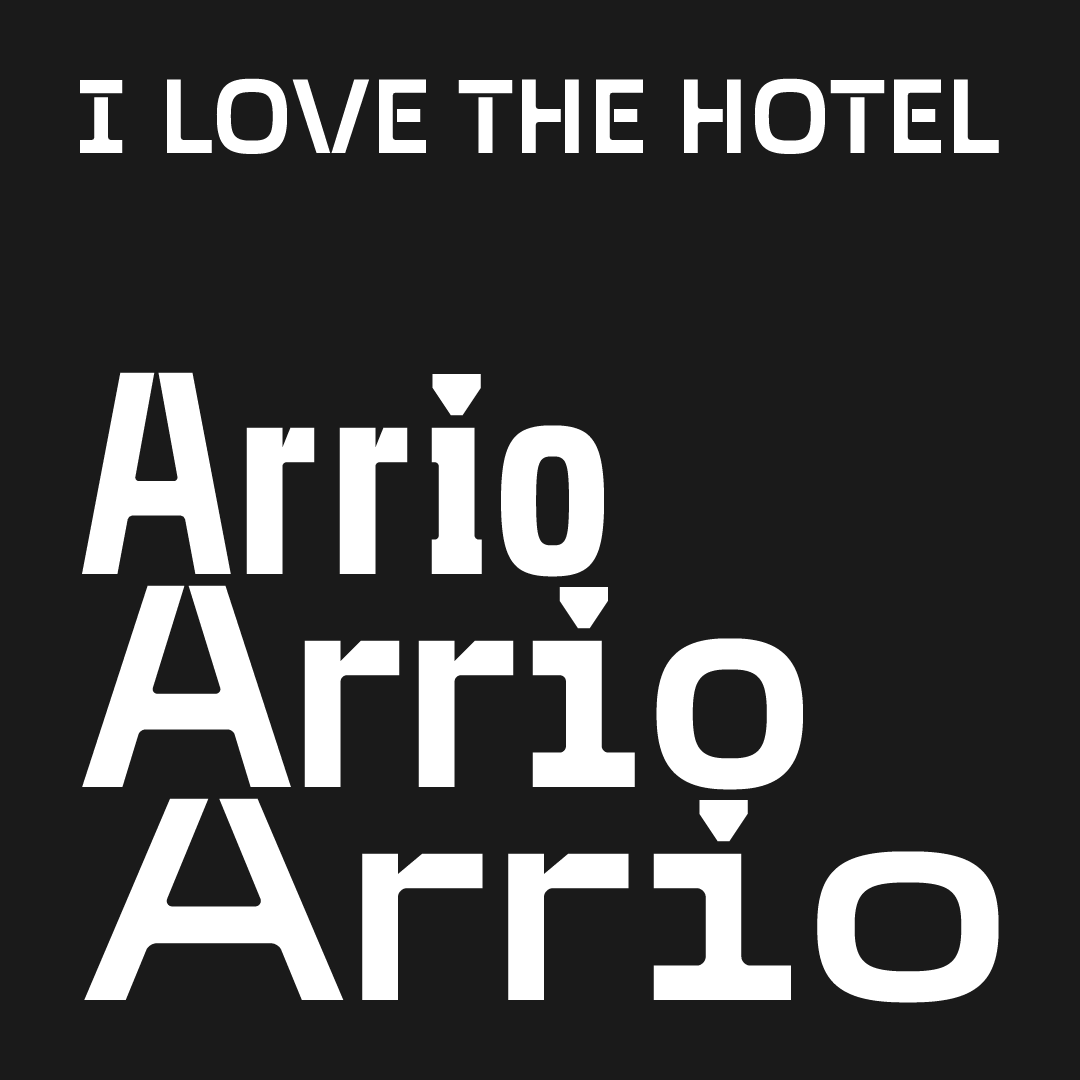
Picture Drop
Just a selection of things I’ve been playing/working with recently.
Interesting Design Nuggets
1️⃣ Lego Typewell
Last month, Interbrand unveiled a new collaboration with the LEGO Group. They helped evolve the brand language of the plastic bricks company. What I find particularly interesting in this project is the use of font files as a digital counterpart to LEGO bricks. You stack glyphs just like you would stack pieces and construction elements for a set. It brings playfulness to graphic design work and helps brand consistency. A smart solution: a type system to replicate a brick system, versatility every step of the way. There is also a full review of the project on Brandnew.
2️⃣ Architecture
I bumped into this project from architecture firm BIG (Bjarke Ingels Group). The project was released in 2022 and was commissioned by the Varde Museum: Denmark’s Refugee Museum. The result is simple and humble, almost discreet and feels obvious and flawless. A fresh breeze compared to large and sometimes pretentious buildings. More of this, please! And yes, from above the building silhouette can look like a glyph.
3️⃣ OFF Brand by Koto Studio
Koto Studio launched their newsletter about brands and design a couple of weeks ago. The second edition is about brand strategy: what it is and what it’s not, and how to work on that. Applicable to any project, not reserved to Fortune 500 companies and startups. They mention the book “The Brand Gap” by Marty Neumeier. I just re-read it. Highly recommended if you are interested in this topic.
A Music Break bridging 1978 to 2024
🪐 Jean-Luc Ponty “Cosmic Messenger” album — 1978
I don’t remember how this album appeared on my radar. But it definitely fits my taste for progressive trippy jazz-rock from the 70s. Two tracks I recommend: “Cosmic Messenger” and “Don’t Let the World Pass You By”.
🌮 BADBADNOTGOOD just dropped a new 6-track EP
It is very jazzy with vibes from Latin America. Special mention for the track “Taco Taco”.
⚡️ SLIFT - Levitation Sessions
High energy, loud guitar riffs and heavy bass and drums for the last item of this selection. The band Slift performed the session inside a spherical building called “La Boule”, in the South of France. Back in the 60s it the sphere hosted a gigantic electron microscope. A perfect scene for the psychedelic space doom performance of Slift.
Enjoy!
Until next time, cheers!
Guillaume
PS: That’s edition number 12. Meaning it’s been more or less a year since I started this publication. 🎂 1️⃣ 🥳