Custom Typeface for a Brand: Pitching

I’ve recently been asked to work on a slide deck for a bespoke font project. It led me to prepare a deck explaining not only why it is interesting for a brand to have their own set of fonts, but as well explain the process and detail the costs and licence fees. Here is what I prepared and what I’ve learned.
The Context
I’m not allowed to share the name of the brand, but I can tell you that this company is manufacturing goods and operates worldwide. So discussing the possibility of having a proprietary typeface is a strategic move for the brand (and the company), as well as a sign of maturity about communication and brand equity. The first request is already precise and I only have to ask a couple of clarifying questions before starting to work on a proposal.
The Deck
Until now, I was not planning on Marmite Defontes to provide custom type services. But I’m ready to take on this opportunity. Luckily for me, drafting estimates and building pitch decks are part of my skill set, after all these years working in agencies.
Here is how I approach the content: what, why, how and for how much, who. To make it more tangible for you, here are each step in more detail.
What Are We Talking About
Rephrase - with your own words - the request to show that you understood the context of the project and what is to achieve. For this deck, there is the introduction to have everyone reading the document on the same level of information and there is the “Brief recap”. The brief recap per se is a less strategic text and more a straight to the point description of the output. I added a set of spectrums to visually represent the recap and to let doors open for discussions. Sliders are very well understood as “we can adjust those parameters”. The clients realise they have options.

You Know Why
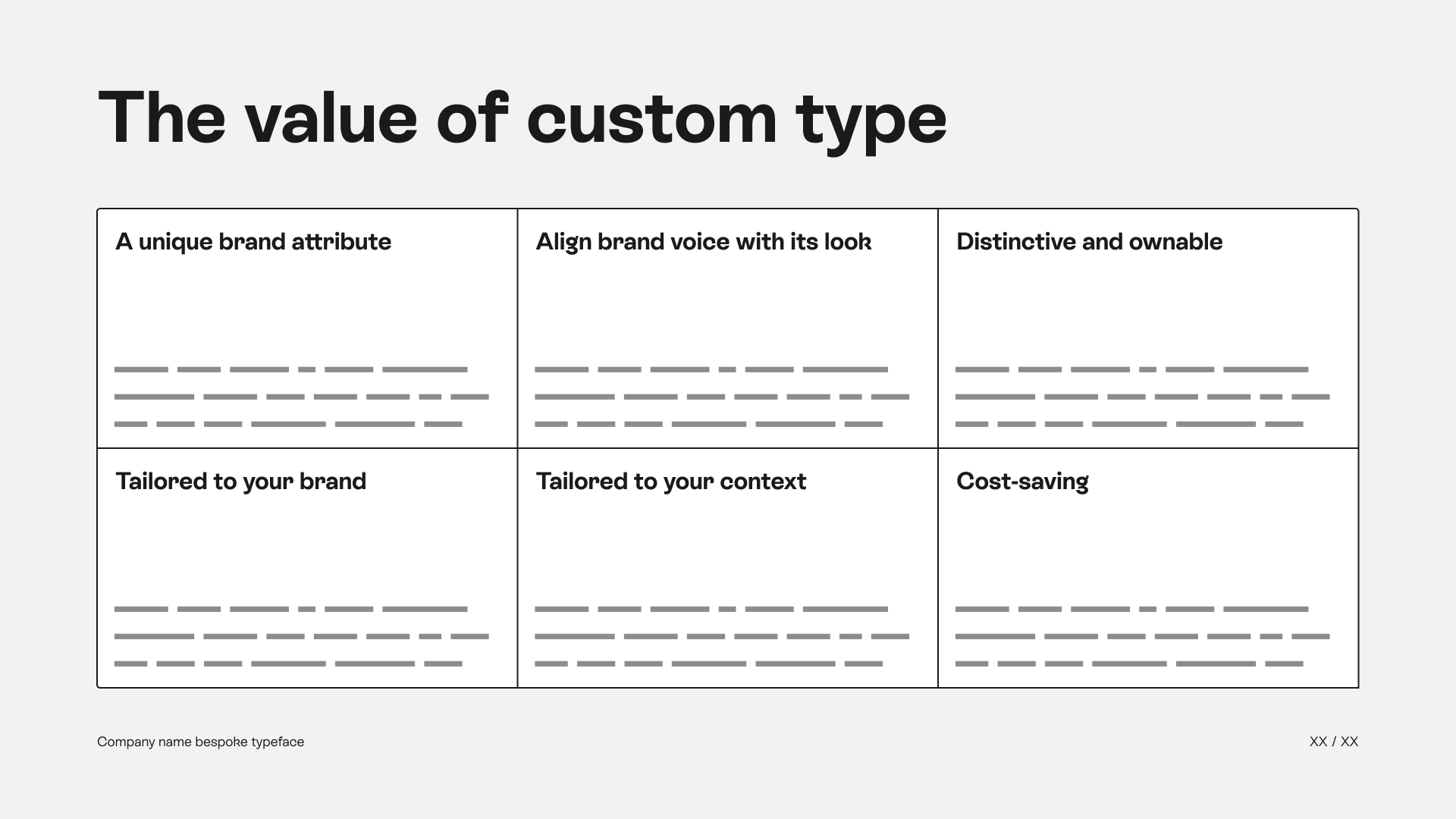
This one is rather short. As the project seems sought after and the request precise, I don’t feel I need to lecture the clients with 40 slides of “Custom Type 101”. A clean slide listing the main benefits of owning a bespoke font family is enough to say, “We know that you know and you know that we do too”.
How: Meat on the Bone
The juicy part of the presentation, at least for me. The part where I get to explain in detail the elements required for the success of the project.
License Scope
How the typeface is planned to be used: territory, physical and digital use. Foundations for the future licence agreement between the designers and the clients.
Typeface Specifications
The technical specifications for the project: how many scripts (with the list of supported languages), the styles (weights, widths, variable axis, etc.), italic version or not, slanted version or not, the platform compatibility, file formats for the delivery, manual or automated kerning, type of hinting and any other important detail that is considered (ligatures, stylistic sets, etc.). Part of our discussion was about expanding in the future to certain scripts and languages, so I included possible expansions in these specifications.

Methodology
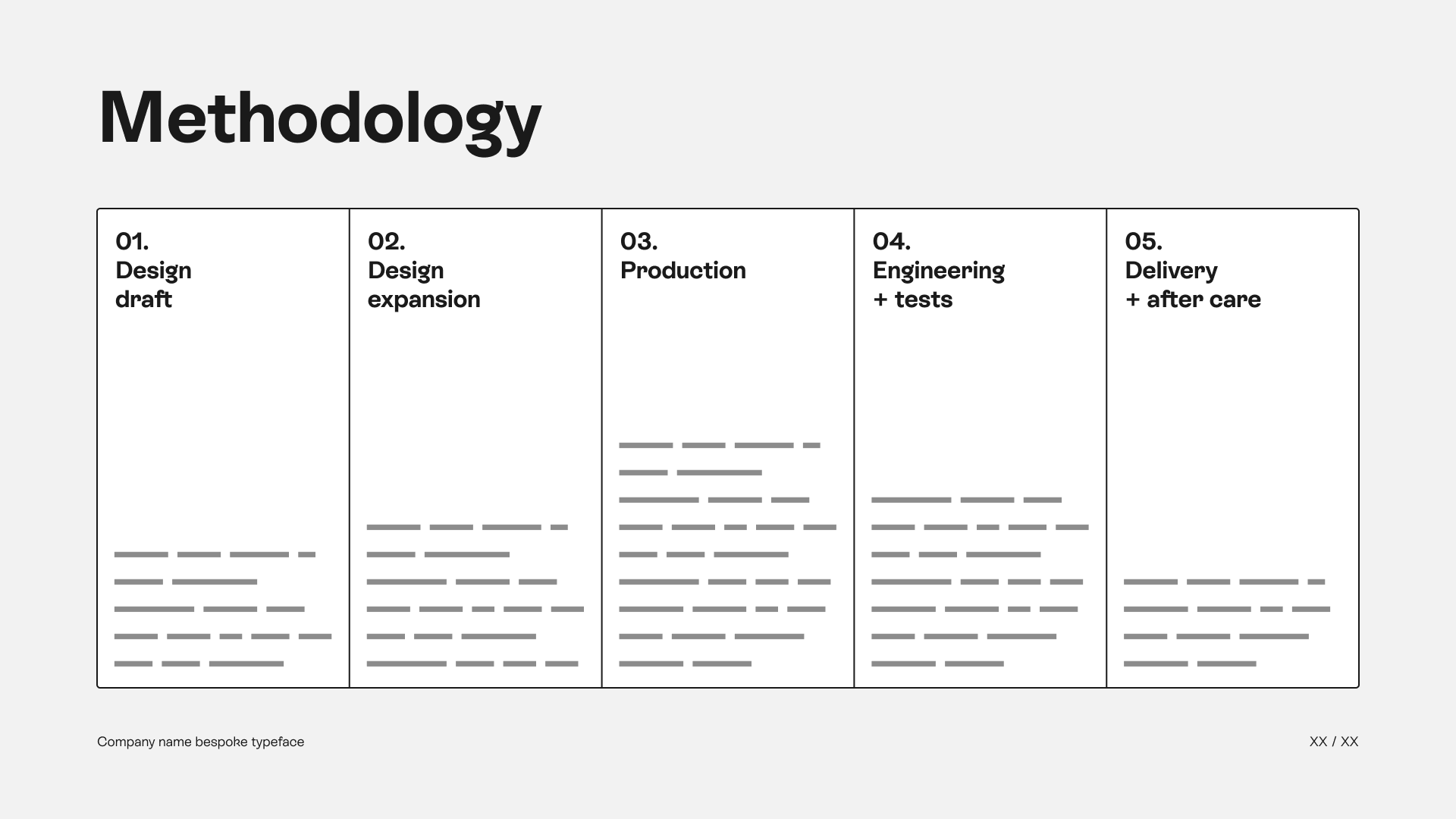
How are we gonna accomplish this work. The slide to describe the main steps going from ideation to delivery. The opportunity to reassure the clients that this work follows a rational process and that each step requires some kind of validation to move forward. Slide tips: I use the length of the description to convey the amount of work required. In this case: Design Expansion, Production and Engineering are the core elements of the work, production being the main fat pillar.
Financial Approach
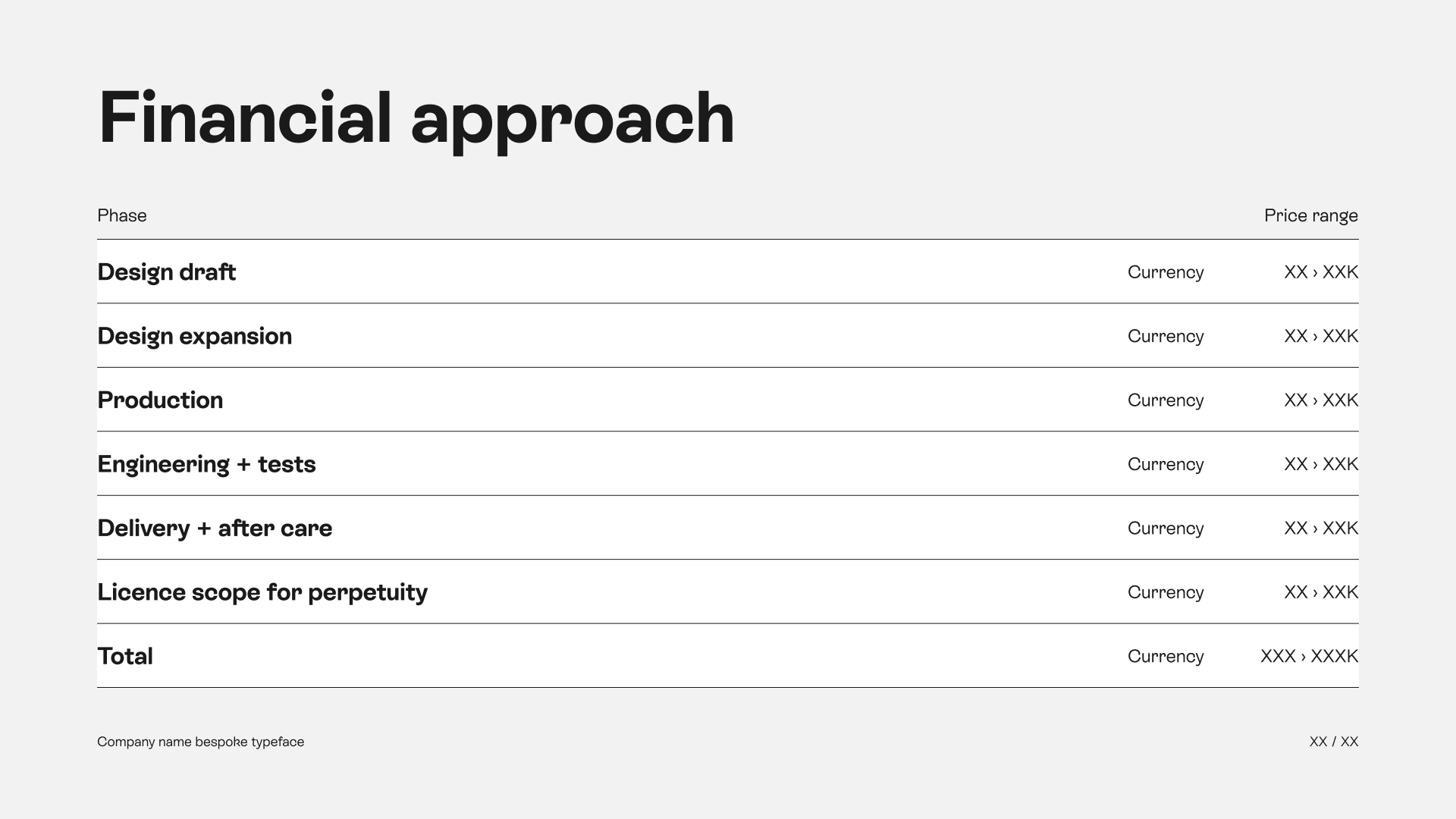
How much does it cost. Now that (almost) every aspect has been laid out: time to list what the investment “could” be. Note the use of the word “approach”. I don’t know their budget, and maybe they don’t know either. So I need to place our best bet to start having the money conversation. The list is made out of the steps explained right before + the licence that also we described prior. The make sure this is gonna be a discussion/negotiation, the price on the right are ranges. Our perception of the best effort necessary on one end and the top effort on the other end. The total range in the end should show how comfortable you are with the project. Large range equals a lot of variability and room for discussion, and a short range equals “We know precisely” what you need and this is the sweet spot.
Who Are You
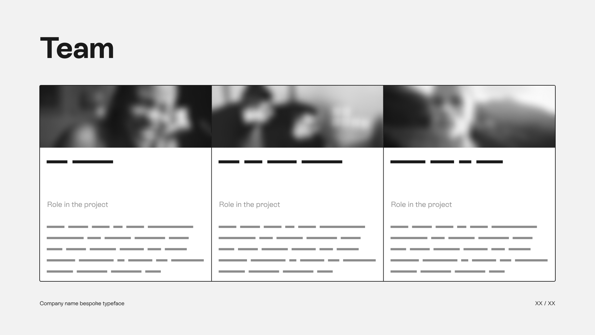
We are the experts. After the money topic, another slide to reassure about the skills: show the people operating the magic. The team: who is doing what and is responsible for which steps during the project.
And a Couple of More Slides
Nothing very specific, but having a bunch of slides to package the presentation is good. Cover slide, content slide, references slides (if you have those), open questions slide, closing slide with next step and contact. Just make sure you send a document that is easy to read with information that is useful and understandable. Especially if you don’t have the opportunity to present the document and answer live to questions.
What I’ve Learned
Preparing the deck, asking clarifying questions and communicating with the client was very straight forward. As mentioned in the introduction, I’ve spent so many years doing it in agencies that applying the same techniques in a (slightly) different context was simple.
I wish I had a bit more exchanges with the people I was in contact with, to learn in detail their motivations and the validation process. Oh and next time: I’ll definitely push hard to present the document. Direct interactions are - for sure - a must to improve the chances of winning the pitch.
I got good feedback on both the form and the content of the deck. This is gonna be a good starting point for the next time!
Epilogue
Long story short, I did not get the job. Here is the context: the idea came to fruition at the client because Monotype was raising their prices (a huge rise from my understanding). In the end, from what I was able to learn, Big M dropped part of their raise. Don’t ask for specifics, I don’t have them. The client was happy with the cut and they were probably using the information on custom fonts we discussed in the negociation process. Of course I was a bit disappointed, but knowing that this work helped the client resist questionable commercial behaviours irons out the story. ✊
Please reach out if you have comments and feedback, want a copy of the deck.
Sources and Links
Some very interesting and useful reads I found during my research for this work:
- “What does it cost to have a custom typeface designed?” by Thomas Phinney
- Why are tech companies making custom typefaces?by Arun Venkatesan
- Price quotation for a new custom fontthread on TypeDrawers
- Soon after this project, Troy Leinster published his Custom Typeface Pricing Template. A very interesting spreadsheet to calculate the cost of producing a bespoke font family. Based on your rates and set of characters in the project. For this occcasion, Troy published a post on the topic: “How to Price a Custom Typeface Project”.
- Hot Type foundry published a newsletter on custom fonts: benefits, scope, licensing, process. The whole shebang. Read this way.
