
3 Ongoing Font Families
For this post, I’m gonna introduce you to three font families I’m currently working on.


Kuiper
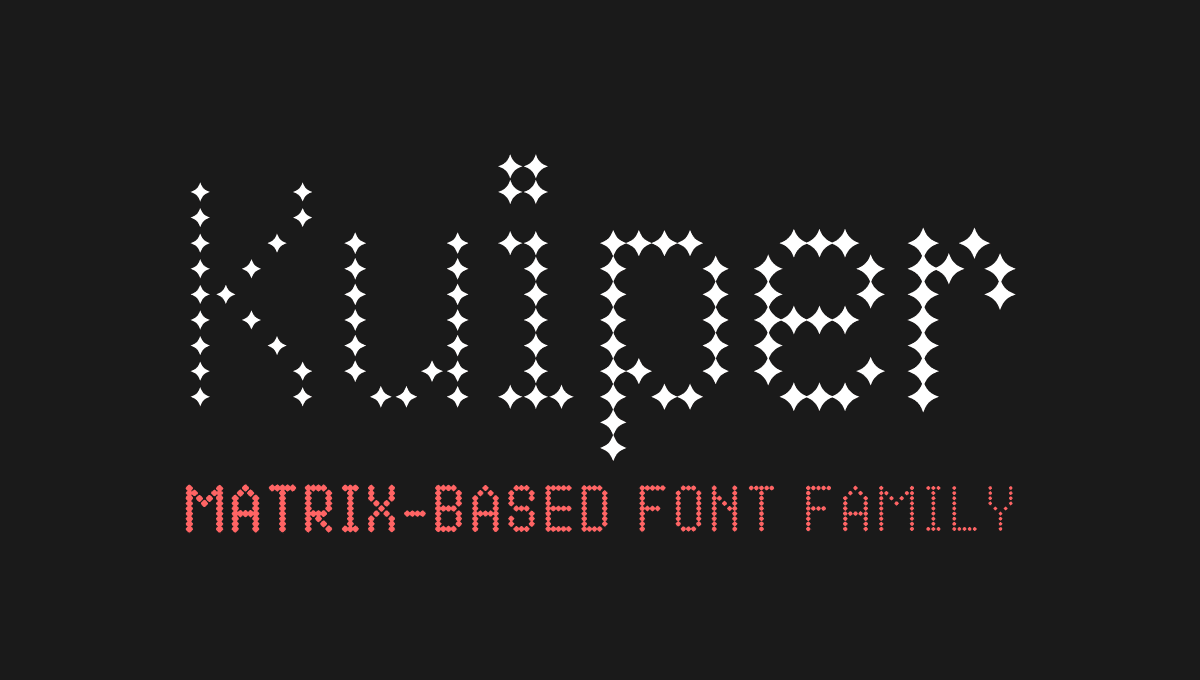
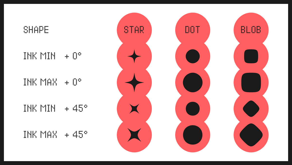
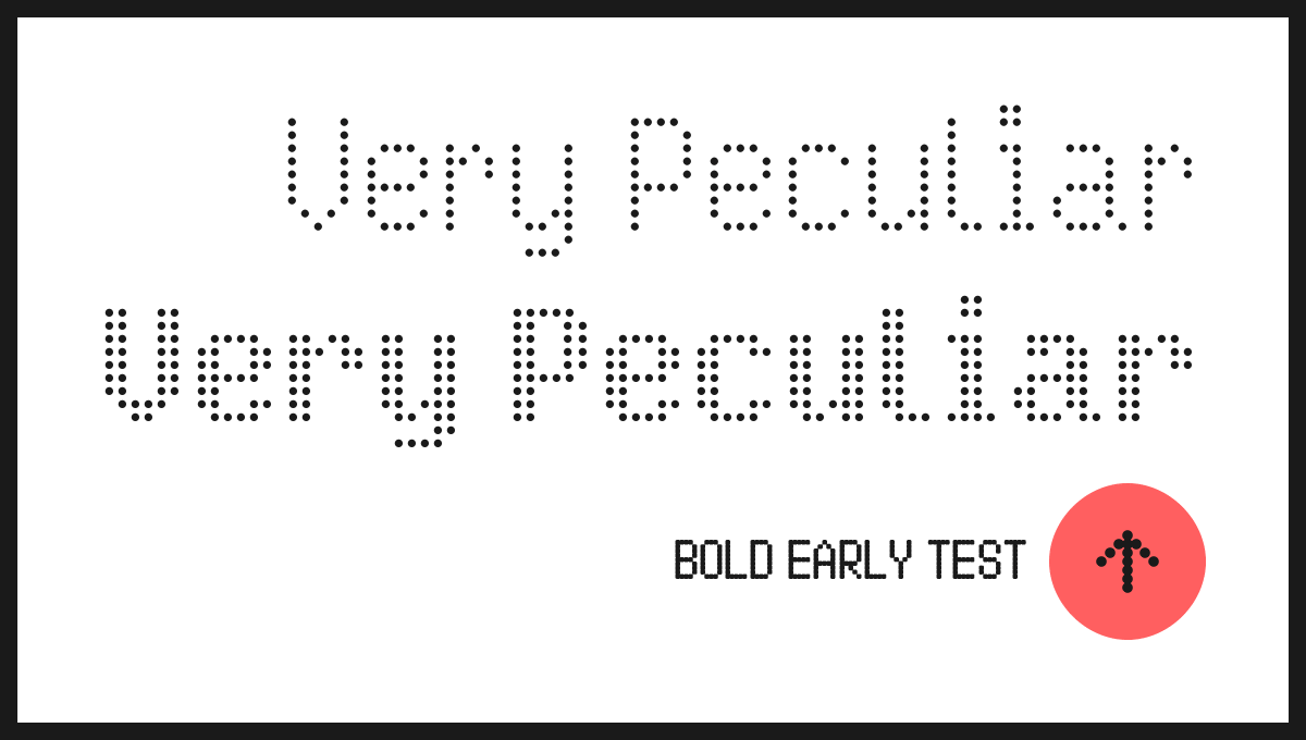
Kuiper is a matrix-based font family and it’s variable. You have 2 axes to play with the drippiness (INKY) and the shape of the dots (DOTS). Added a third axis preparing the newsletter, silly me! So you have a rotation axis now (TURN).
Backstory
It all began with a receipt ticket I kept. I was still a student in art school in Lyon and purchasing arts and craft supplies was a routine. One day, I saw in the shop receipt a potential font project. A tiny piece of paper and smudgy printed letters and figures transformed into another font: amazing! I did find the original receipt and the first design for this project. It still feels like something designers would enjoy using for their projects. Let’s go for a revised version.
Current version
I decided to completely revise the design of this project and use variable axes to make it versatile. Adding variability to it changes possible look and feel and enables you to adapt the rendering of the font in different contexts (display size, display type, mood, if printed: the quantity of ink you want to use, etc.).
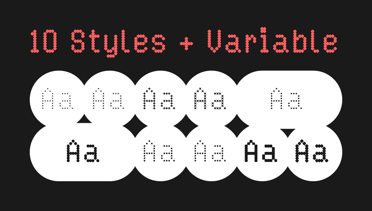
As of today the design space is a Regular style with 10 outputs (and all the variations in between). I just added the “star” dot shape, because it looks good and it is fun. Technically, it’s 12 styles, but when you turn a circle 45°, it still looks the same. 😆
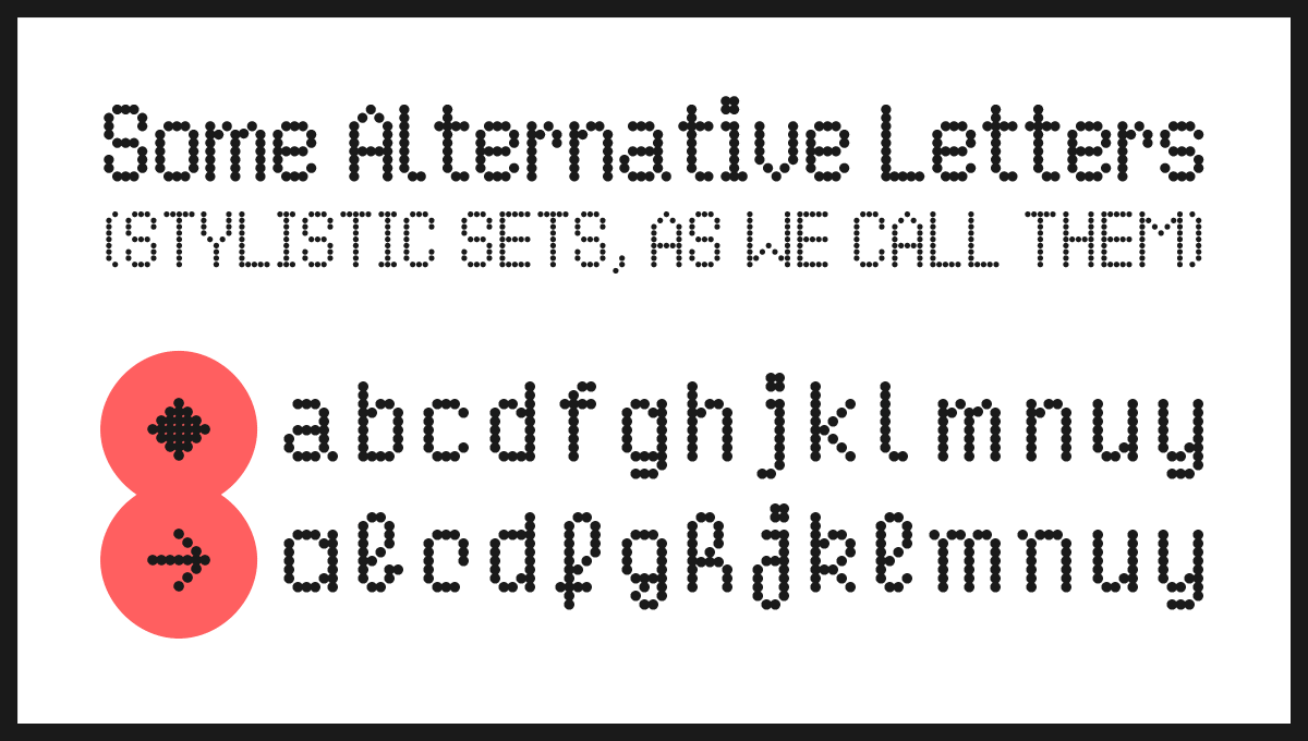
The character set already covers many languages and I’m adding some symbols and alternates to the mix. The spacing needs some adjustments and kerning needs to be done.
I’m planning - once the Regular version is finished - to do a Bold version (see below).
About the Name
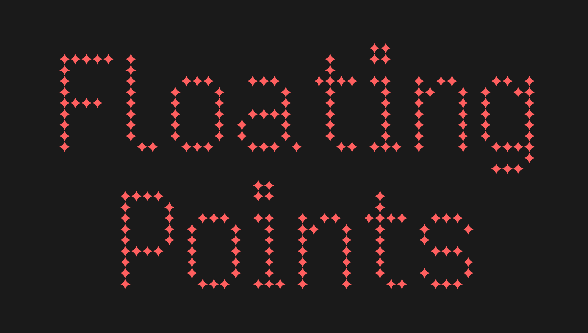
It is a direct reference to the Dutch astronomer Gerrit Pieter Kuiper. It is also an 18-minute track from Floating Points.
Dots › Stars › Constellation › Space › Astronomy › Kuiper › Dots › Floating Points › Shapes › Moving particles › Light › …
You see how one idea can lead to another and how my brain works 😄
🎧 Listen to “Kuiper” from Floating Points: Apple Music — Spotify — YouTube
✨ Paid subscribers have access to the beta files of Kuiper. ✨
Untitled (for now)
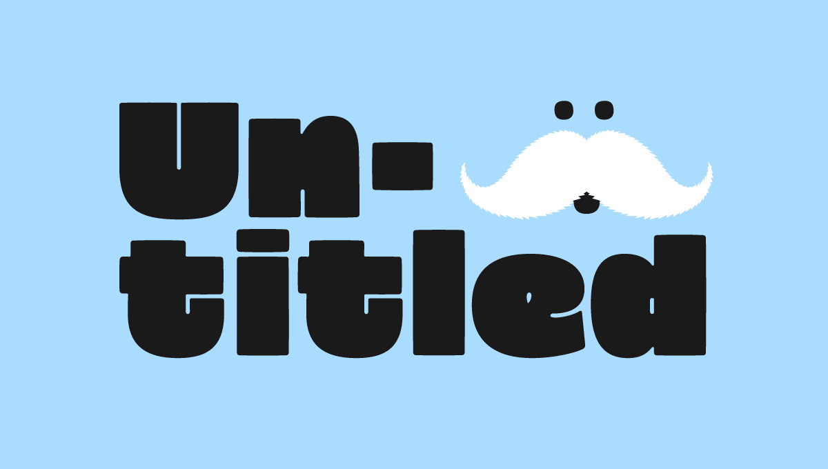
This font project is not as “old” as Kuiper, but still… It needs to be named! It has a codename, but I don’t like it at all. After reading its introduction, if you have naming ideas, please reach out!
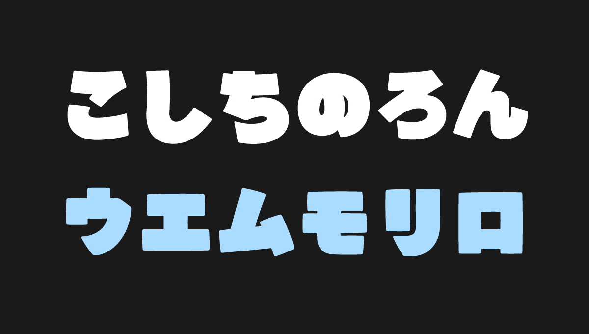
In a totally different genre (even if it’s again a display font), this one is funkier. The shapes are generous and the whole idea is that each glyph take as much black space as possible before we lose legibility. Like a balloon before the critical explosion point.
It is not a family yet, but I’m looking to bring a companion to the current style. What you see is the Puff weight (UltraBold if we want to be serious about style naming). The companion I’m working on is not a sibling. I don’t want a Slim weight just for the sake of generating 5 or 6 in between interpolations. Think of it more as Laurel and Hardy or peanut butter and jam (if we’re keeping the food metaphors).
The character set enables most western languages already. I want to fine-tune this set before moving on to additional language support.
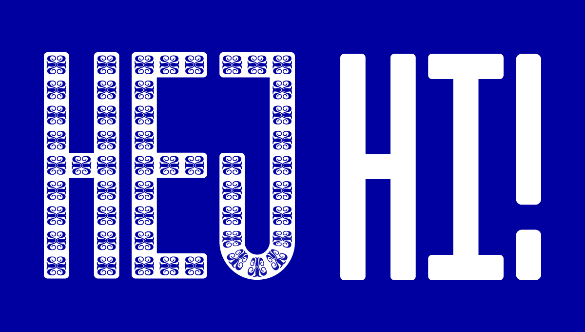
I also started to play around with Japanese Hiragana and Katakana, to see if that would make sense for the project. My Japanese is really, really rusty, so I need to find external help to proof this. #NotAskingForAFriend
✨ Paid subscribers have access to the beta file of “Untitled”. ✨
Luza
🥹 Still here? Let me know if this format is too long.
A project still to be (precisely) defined
This one is the least advanced of the three. But here goes nothing!
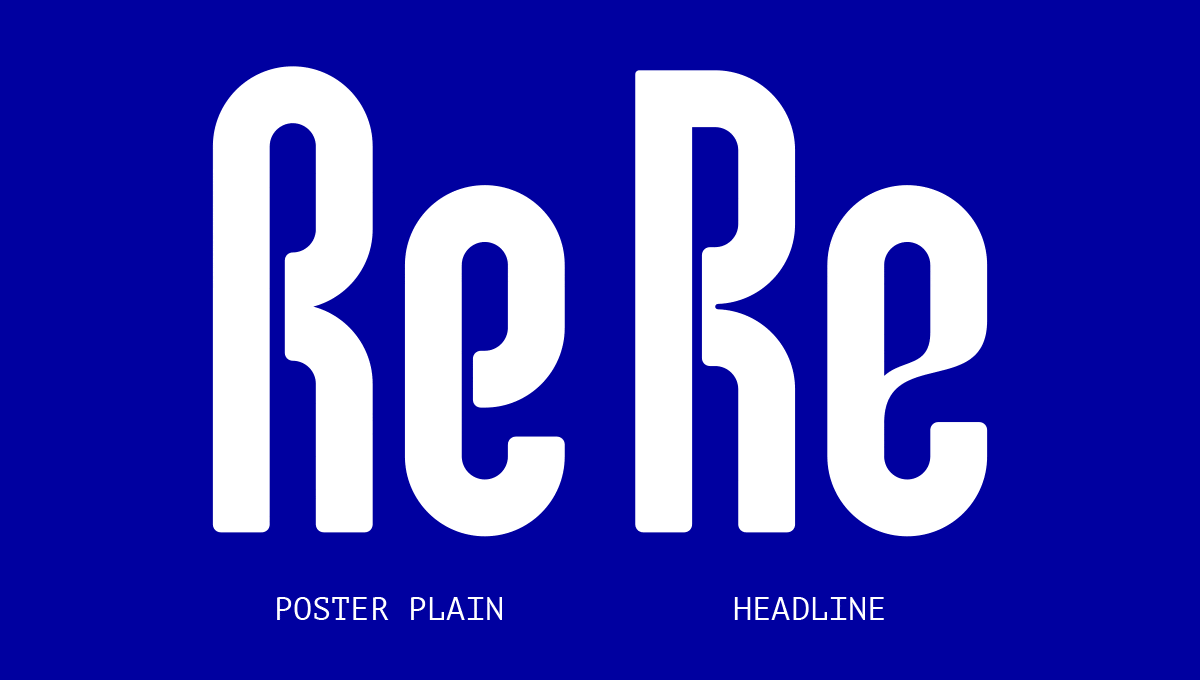
It is a larger family, still a display font family. I’m gonna just show you what is planned and a couple of tests.
The family is composed of two “sisters”:
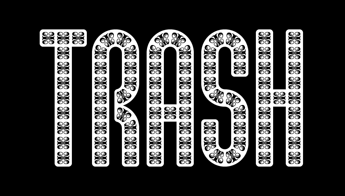
- A poster version with 1 weight in 4 variations (1 plain + 3 different patterns)
- A headline version with 3 weights: Light, Medium and Bold… For now…
The design space is rather large and I’m still assessing the work required and how to produce all this efficiently. One technical point being the patterns: level of detail, worth the trouble, how to automatise the drawing process, etc.
Origin
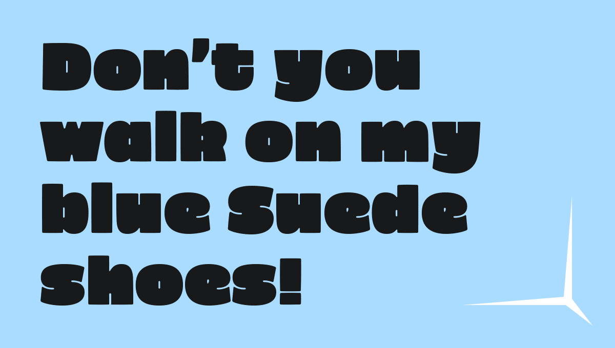
The foundation design was made during my 100 Days of Lettering challenge. I had a lot of fun building this lettering. So I wanted to explore it a bit more. I am working on the system supporting a complete font family, based on this initial idea.
The family is a distant homage to the art of ceramic tiling from Portugal (Azulejo). That doesn’t mean that this font used to be used only in blue! The name contains the four letters A + Z + U + L, but organised differently. It could have been close to the Arabic word for ceramic tilling: al zulaydj, زليج, “small polished stone”, would sound great too. Luza is a form of the verb luzir (shine) in Portuguese, it means the crowd/mob in Czech and means “it is coming” in Xhosa (a language spoken in South Africa Zimbabwe or Lesotho). Love digging for cultures and meaning! 😄
Closing Remarks
In the next post, I’m gonna be writing about languages and writing systems. Not getting too nerdy, but to explain where I’m standing.
Until then: 🖤 like, 💬 comment, ✴️ ask questions and share with anyone that might like it.
Thank you. Cheers,
Guillaume
PS: The 20 people getting free stickers should have received another email to submit their adresses.